
The 8 static ad layouts big brands use, and how common each one is
By Spencer Tribe · Last updated
Almost every static ad on Meta uses one of eight layouts. The most common by far is product hero, at 46% of the 1,725 major-brand ads in the Showfolk library, followed by lifestyle (17.4%) and text only (11.9%). Picking the layout first is the fastest way to decide what an ad should look like.
What are the eight layouts?
| Layout | What it is | Share |
|---|---|---|
| Product hero | The product fills the frame on a clean or styled background, with a short headline. The default for anything physical. | 46% |
| Lifestyle | The product in use, in a real setting, usually with a person. Sells the life around the product. | 17.4% |
| Text only | Type on a color or texture with no photo. Common for software, services and offers. | 11.9% |
| Testimonial | A customer quote or review is the headline, often with stars or a name. | 5.1% |
| Feature callout | The product with labels or arrows pointing at what makes it different. | 4.4% |
| Comparison | Us and them, side by side, as two columns or a checklist. | 4.1% |
| UGC style | Made to look like a customer's own photo or a phone screenshot, not an ad. | 3% |
| Before and after | Two states of the same thing, split down the middle. | 2.1% |
Figures are from the Showfolk library (1,725 ads from 163 brands, as of 2026-10-09). It is a curated sample, not a census of Meta. Method and full tables.
Which layout should a small business start with?
Start where the big brands in your category already are. If you sell a physical product, that is almost always a product hero: it needs one good photo and a short headline, and it is the hardest layout to get wrong. If you sell a service or software, a text-only ad or a testimonial does the same job without a product shot. Add a second layout only once the first is running, so you can tell which one is working.
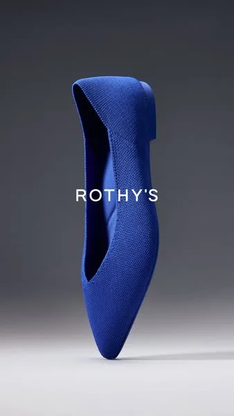
The reference: an ad a major brand is running.
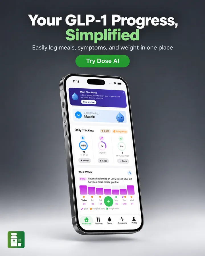
What Showfolk made from it for an app.
Which hooks go with them?
The hook is what the headline leads with. Across the library the order is:
| Hook | Share of ads |
|---|---|
| Benefit | 34.7% |
| Problem and solution | 25.9% |
| Offer | 19.1% |
| Social proof | 12.3% |
| Curiosity | 4.3% |
| Urgency | 1.7% |
Benefit and problem-and-solution hooks suit any layout. Offers pair naturally with product hero and text-only ads. Social proof is the testimonial layout’s reason to exist.
How much text do these ads carry?
Less than most people expect. 93.8% of ads in the library carry low or medium amounts of text, and the median headline is 6 words long. 71.1% show the product and 35.3% show a person.
Does the mix change by industry?
| Industry | Most common layout | Most common hook | Ads |
|---|---|---|---|
| Business SaaS | Text only (25.6%) | Problem and solution (39%) | 313 |
| Fashion e-commerce | Product hero (64.2%) | Benefit (46.6%) | 268 |
| Food & beverage e-commerce | Product hero (67.3%) | Offer (37.9%) | 211 |
| Home services | Lifestyle (47.8%) | Problem and solution (36.6%) | 205 |
| Health e-commerce | Product hero (76.5%) | Offer (42.2%) | 166 |
| General retail e-commerce | Product hero (57.9%) | Benefit (52.1%) | 121 |
| Technology SaaS | Product hero (28.7%) | Problem and solution (39.1%) | 115 |
Only industries with at least 100 ads in the library are shown.