
Why AI image tools garble text and logos in ads, and how to avoid it
By Spencer Tribe · Last updated
AI image models paint pixels that look like lettering; they do not set type. They have also never seen your logo, so they draw something that resembles a logo instead. Newer models spell short headlines correctly most of the time, but small text, long copy and exact brand marks still fail. The reliable fix is to keep text and logos out of the generated image and place them on top as real layers.
Why does the text come out wrong?
An image model learns what pictures look like, including pictures that contain words. When you ask for a headline it produces shapes that are statistically like that headline. With a short phrase in large type the shapes are usually right. As the text gets smaller or longer, errors creep in: a doubled letter, a missing word, a price with the wrong digit. Nothing in the model checks spelling, because to the model there is no spelling, only texture.
Why does my logo come out wrong?
Your logo is one exact arrangement of shapes, and the model was almost certainly never trained on it. Even when you upload it as a reference, most models treat it as inspiration and redraw it, which shifts proportions, colors and letterforms. A logo that is 95% right is wrong. The same applies to product packaging: labels are text and logos on a curved surface, which is the hardest case of all.
What actually fixes it?
- Separate the picture from the type. Generate the scene with empty space where the headline goes, then set the headline as real text on top. This is how designers have always worked, and it makes spelling errors impossible.
- Never let the model draw the logo. Place your real logo file over the finished image.
- Use your real product photo. Cut it out and composite it, so the label stays exactly as printed.
- If you must generate text, keep it short and big. Five words or fewer, then read every character before you publish.
How does Showfolk handle this?
Showfolk uses hybrid rendering. The image model produces the scene and composition, and your logo and headline are composited afterwards as real layers from your brand kit. Copy is read back and checked for spelling, and your product is never redrawn. How it works, step by step.
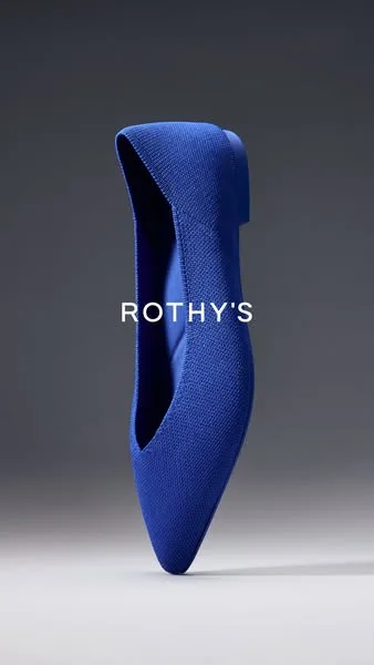
The reference: an ad a major brand is running.

What Showfolk made from it for an app.
Will better models make this go away?
Partly. Text rendering improves with every model generation, and short headlines are already dependable in the best ones. Exact logos are a different problem: the model would need your specific mark, reproduced perfectly, every time. Compositing will stay the dependable answer for brand marks for the foreseeable future.